Showing posts with label HTML reports. Show all posts

March 9, 2013

How to easily code your Spreadsheet filters for Google Charts with the Javascript Visualization API


Google Chart's are pretty cool! they help you easily add charts to your web pages/apps with a very professional and clean output, even better, when they make updates to the Charts, the improvements get's applied to your page or app automatically and most of the time with no or very little modifications to your code.

There's also the Google Chart's Playground that will help you to easily code and test your charts, and it's full of very useful examples. If you haven't tried already, I suggest you to check it out when you get a chance.

But hand-writing static data for your charts it's not what you are looking for in most cases, luckily the guys at the Google Charts team provided many ways to import your data, on this article I will focus on what I believe it's  the most powerful/flexible feature of Google docs which is Spreadsheets. With a capacity of 400,000 cells it's more than adequate for most small/medium size DB needs and it's pretty fast if used properly! With the added benefit that you can see, share and edit the DB itself directly from the spreadsheet, it's like a 1,000 times more natural for any normal human than reading it from raw code and/or having to make query's to get some data like with SQL or even Google Cloud Storage (which it's usually CSV data).

Also you can use split your data in different Spreadsheets to leverage size and improve speed and readability if your handling tons of data, and it's all for free, BUT you do need to get that information, put it all together, filter it and get it ready to display on your favorite chart/s and finding the right way to do so can be annoying at first, so let's explore a simple and very flexible way to do this using the Visualization API and some Javascript parsing.

First we need to see our data, let's imagine we have a few Salesman and we record the every sale in a spreadsheet saving the salesman's name, the amount he/she sold and the date.


Before we start coding,we need to publish the Spreadsheet we've just created, we are going to need the public URL to query it's contents from Javascript.


Important Note: Be careful on this part, only the people who has access to the spreadsheet will be able to use your HTML/Javascript Charts, so be extra careful if you choose to make it public to the web or just available to specific users. 


Now let's hit the code! We need to send a query to the public URL of the spreadsheet to pass it's contents to a Javascript function, so let's write a function specifically to do this:


It's a best-practice to start the function that will parse the response with an error handler, this could be easily done using an if-clause like this.


Assuming we didn't received an error (I've never seen it actually happening), we have to get our data table and it's a good time to sort it so let's sort it by Platform, it's quite easy!


Now we have to build the filter, assuming we want to change the order to |Date|Salesman|Sale|. This is a very simple way to plan the filter by analysing our Spreadsheet's headers:


To do this filter, first we name the variable, then we call the Visualization's API data class to group and rearrange our data, this method requires the name of the variable containing the original data (in this case data), then we write the number of the columns in the order we want to show/group, finally we want to sum the last column (Sales) to show the total sale of each salesman, each day.


It's ready to draw! for this kind of data a Tabla Chart it's the most suitable one. (We'll discuss how to take the most out of a Date|Object|Sum piece of data parsing it to properly display inside a Line Chart) but first we need to add the $ prefix to the Sales column, here's how to do it:
Note: Use the column number of the filtered data table (chartFilter).


But just plain numbers inside a Table Chart it's boring right? to get that you can just use an iframe to display the data and save yourself all the trouble... But a Table Chart can do so much more, let's just scratch the surface by embedding some HTML formatting to the cells to give it a little bit more flavor, let's embed a Bar Format to make your Table more meaningful for the user.


Well, it's time to put it all together, let's get a look at it!


To see it in action (and check the complete HTML), click on the following image:


Also, if you like the contents of this article there is a public folder with all the documents, pictures and the example page in the following link:

https://docs.google.com/folder/d/0B_RClkFMLkcpVHljWk53ZEhzU2s/edit?usp=sharing

Feel free to post your ideas, suggestions, requests, etc at the bottom of this article.

Happy coding!

February 26, 2013

How to integrate Google Charts, Apps Script JSONP, Spreadsheets & Drive hosted HTML/JS


First things first, it's very easy to draw Charts in your public HTML using the Google Visualization API for Javascript, you can even get help with the code using the Code Playground of the Visualization API, and usually we want to get our data from some Google Spreadsheet, piece of cake...

But things get nasty when you want to use all that juicy flexibility and the data comes from different sources and/or it's "heavy" data that requires local filtering and/or parsing (or simply way too big)... The code get's too large for comfort and too heavy on processor and therefore won't run smoothly on most devices/networks, plus it's a pain to debug or update...

Simply try placing many charts and query data like specific strings and numbers (from the Visualization API) to build some super-cool auto-report on a webpage and it WILL get slow on most devices, plus it will expose all your precious algorithms, code and even some of the structure of your (or your client's) data, even if they don't have the proper OAuth token and Google Account rights to see the actual data, they can get a lot of information just by looking at the public code... And nobody wants any of this (except some curious hackers and opportunist crackers).

Ok, ok.... so what changes with Apps Script? How does it help me to solve all this?. Well, let's mention some of the good stuff:

  • Apps Script handles the query's to Spreadsheets and deliver exactly the data you need ready to visualize inside a Chart, and it does it very fast. 
  • You can leverage client-side broadband/processor needs. 
  • You don't expose the code in the servlets! Nor your keys or ID's, also you can choose who can use the servlet, this all greatly enhance security and privacy. 
  • Different charts needs different views of the data and they all usually need some parsing, you can create one Apps Scipt servlet for each chart, this will make your pre-processing run in parallel on the server side! 
  • You can create one (or many if you handle too much data) servlets to query pieces of specific data like names, values, etc. and pack all that information inside a JSONP object that can be easily broken apart with Javascript to distribute the values across your HTML report page, put some CSS3 in the mix and you can code some nice reports. 
  • Apps Script has far better integration with Google APIs than Javascript plus you code from a cloud editor, so you don't need to install anything, and you enjoy of thing like auto-complete. 
  • You can publish some Scripts as Webapps and use them as library's so you can recycle code and debug/update faster (and safer using the versions systems). 
  • You can easily use/change different data feeds, BigQuery, Cloud Storage, Script DB, etc. without touching the HTML and once it's ready, you just change the version and it will be reflected on your sites instantly. 
  • Google Apps Script, Charts, Visualization API, Spreadsheets, hosting HTML/JS/CSS3, etc. it's FREE. 


Quite a bit right? and one could mention a few more, but this are the "highlights" in my opinion...

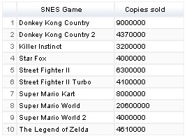
Let's build an example, to keep it "simple" the source will be the most copies sold top 10 SNES games

First we are going to need the data inside a Google Spreadsheet, and we only need the Key of the Spreadsheet for the servlet, this one correspond the the example we will be using:
0AvRClkFMLkcpdGcyWW1xNm83MzlRNXJZS21WSWR3ZUE

Note. For your own spreadsheet to work properly, don't forget to "Publish to the web"

Now let's create a JSONP servlet to query that data and prepare it (if you are not familiar with delivering JSONP content with Google Apps Script maybe you should consider reading this article first).

To prepare data for charts using GAS JSONP servlets, it's best to pack it using Literal Object Notation, it might be tricky to get right at first, but it's much more flexible since it allows you to use the new Data Roles which helps you to create very customized charts, also the visualization engine process Literal Object Notation faster (on the client side) than other 
methods effectively placing most processing work on the server side so you can process in parallel the data you need for the charts before passing it your HTML (feel free to read more about the JavaScript Literal Initializer for Google Charts in the documentation here and here).

First let's take a look at how our example Spreadsheet would look like once it's transformed into Literal Object notation:


{
cols: [
{id: "null", label: "SNES Game", type: "string"},
{id: "null", label: "Copies sold", type: "string"}
],
rows: [
{c:[{v: "Donkey Kong Country"},{v: "9000000"}]},
{c:[{v: "Donkey Kong Country 2"},{v: "4370000"}]},
{c:[{v: "Killer Instinct"},{v: "3200000"}]},
{c:[{v: "Star Fox"},{v: "4000000"}]},
{c:[{v: "Street Fighter II"},{v: "6300000"}]},
{c:[{v: "Street Fighter II Turbo"},{v: "4100000"}]},
{c:[{v: "Super Mario Kart"},{v: "8000000"}]},
{c:[{v: "Super Mario World"},{v: "20600000"}]},
{c:[{v: "Super Mario World 2"},{v: "4000000"}]},
{c:[{v: "The Legend of Zelda"},{v: "4610000"}]}
]
}


After looking at it, one notices that it will require to be parsed in two different parts, one for cols (which contains the column names) and another for rows (which contains the data inside the cells of each row).


First let's build the code for what I like to call the "canvas" of the Object Literal Notation along with the data we are going to need for the parsing jobs:

function doGet(request) {
 var ss = SpreadsheetApp.openById('0AvRClkFMLkcpdGcyWW1xNm83MzlRNXJZS21WSWR3ZUE');
 
 var data = ss.getSheetByName('SNES top 10');
 var columnsContent = [];
 var rowsContent = [];
 var columnsNumber = data.getLastColumn();
 var rowsNumber = data.getLastRow();
 
 return ContentService.createTextOutput(
   request.parameters.prefix + '({ cols: [' + columnsContent + '], rows: [' + rowsContent + '] })')
   .setMimeType(ContentService.MimeType.JSON);
}


This would parse the following output (the "canvas" for Object Literal Notation):

undefined({ cols: [], rows: [] })

Now let's build the code for parsing the cols:


// Columns
for (var i = 1; i <= columnsNumber; i++) {
var columnContent = [];
columnContent = '{id: "null", label: "' + data.getRange(1, i).getValue() + '", type: "string"}';
columnsContent.push(columnContent);

}


This would parse the following output for our example:


{id: "null", label: "SNES Game", type: "string"},
{id: "null", label: "Copies sold", type: "string"}


Now let's build the code for parsing the rows:


// Rows
 for (var i = 2; i <= rowsNumber; i++) {
   var rowObjects = [];
   for (var j = 1; j <= columnsNumber; j++) {
     var cellContent = [];
     var cellContent = '{v: "' +  data.getRange(i, j).getValue() + '"}';
     rowObjects.push(cellContent);
   }
   var rowContent = [];
   rowContent = '{c:[' + rowObjects + ']}';
   rowsContent.push(rowContent);
 }


This would parse the following output for our example:

{c:[{v: "Donkey Kong Country"},{v: "9000000"}]},
{c:[{v: "Donkey Kong Country 2"},{v: "4370000"}]},
{c:[{v: "Killer Instinct"},{v: "3200000"}]},
{c:[{v: "Star Fox"},{v: "4000000"}]},
{c:[{v: "Street Fighter II"},{v: "6300000"}]},
{c:[{v: "Street Fighter II Turbo"},{v: "4100000"}]},

{c:[{v: "Super Mario Kart"},{v: "8000000"}]},
{c:[{v: "Super Mario World"},{v: "20600000"}]},
{c:[{v: "Super Mario World 2"},{v: "4000000"}]},
{c:[{v: "The Legend of Zelda"},{v: "4610000"}]}


Now let's put it all together and see how it looks: 


function doGet(request) {
var ss = SpreadsheetApp.openById('0AvRClkFMLkcpdGcyWW1xNm83MzlRNXJZS21WSWR3ZUE');
 var data = ss.getSheetByName('SNES top 10');
 var columnsContent = [];
 var rowsContent = [];
 var columnsNumber = data.getLastColumn();
 var rowsNumber = data.getLastRow();

// Columns
 for (var i = 1; i <= columnsNumber; i++) {
var columnContent = [];
columnContent = '{id: "null", label: "' + data.getRange(1, i).getValue() + '", type: "string"}';
columnsContent.push(columnContent);
 }

// Rows
 for (var i = 2; i <= rowsNumber; i++) {
   var rowObjects = [];
   for (var j = 1; j <= columnsNumber; j++) {
     var cellContent = [];
     var cellContent = '{v: "' +  data.getRange(i, j).getValue() + '"}';
     rowObjects.push(cellContent);
   }
   var rowContent = [];
   rowContent = '{c:[' + rowObjects + ']}';
   rowsContent.push(rowContent);
 }

 return ContentService.createTextOutput(
   request.parameters.prefix + '({ cols: [' + columnsContent + '], rows: [' + rowsContent + '] })')
   .setMimeType(ContentService.MimeType.JSON);
}


And that's it! You can check the output of our example if you click on it's published link:

https://script.google.com/macros/s/AKfycbwFbraExcWCt9dBWdG2th8M_AaBXY_YJEli7pFYVDytxPRcUYGg/exec

Since the Google Visualization API supports Object Literal Notation natively, there is no need for parsing, just pass the data to a function and put it inside a DataTable for charts to draw, for example:

Javascript:


function OLNtoChart(OLNdata){
var data = new google.visualization.DataTable(OLNdata);
var tableChart = new google.visualization.Table(document.getElementById('tableChart'));
tableChart.draw(data, {showRowNumber: true});
}


HTML:

<id="tableChart"></>
<script type="text/javascript" src="https://script.google.com/macros/s/AKfycbwFbraExcWCt9dBWdG2th8M_AaBXY_YJEli7pFYVDytxPRcUYGg/exec?prefix=OLNtoChart"></script>


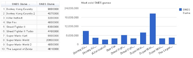
You can check how to draw more interesting charts in the Google Charts webpage. Feel free to post your ideas, suggestions, requests, etc at the bottom of this article.


Here you can see a fully working example published on Google Drive HTML hosting:


Happy coding!